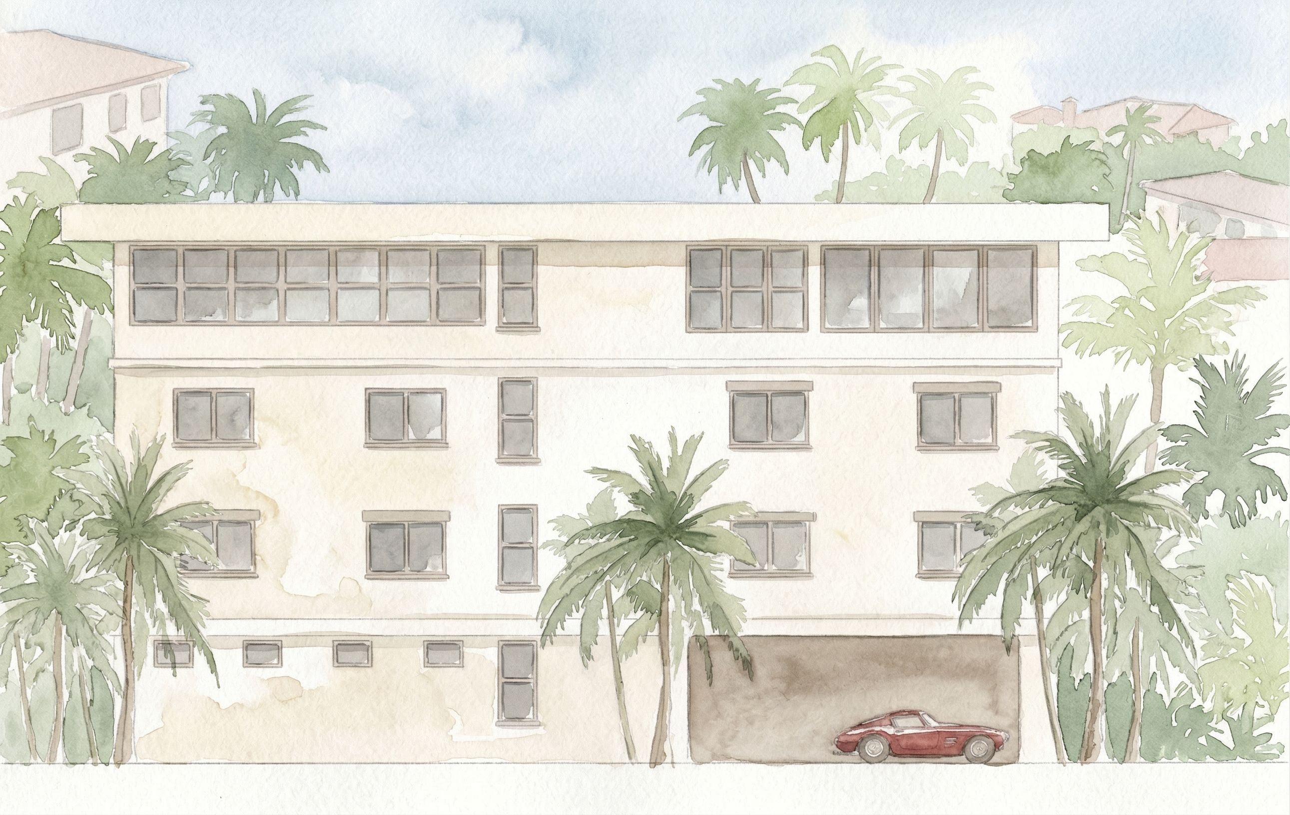
DO NOT change the architecture in any way. Do not alter proportions, windows, or layout. Do not add or remove elements. Do not crop the image. Keep the view front-on with minimal depth, maintaining the clarity of an architectural elevation. PROJECTION CONTROL VERY IMPORTANT: Maintain a primarily front-on elevation Allow only minimal and controlled depth All horizontal lines must remain level All vertical lines must remain straight The roof must read as flat with no visible top surface or distortion STYLE TRUE WATERCOLOR — CRITICAL: The image must read as a hand-painted watercolor, not a filtered or photoreal image Fully reinterpret the image using watercolor techniques Simulate real watercolor behavior on textured paper: • visible pigment variation • soft pooling and blotching • uneven tonal washes Edges should vary naturally: • some soft and diffused • some slightly defined from brush pressure Avoid smooth digital gradients — transitions should feel organic Introduce subtle watercolor paper texture throughout Simplify detail and remove photoreal sharpness IMPORTANT: Do NOT apply a watercolor filter The image should look painted by hand BUILDING PRIMARY FOCUS — KEEP CONTROLLED: Main stucco: warm creamy white HEX #EFE7DA Subtle tonal variation only highlights #F6F1E8, shadows #E4DBCC Windows: soft gray HEX #B8B6B0, minimal reflection Trim and railings: muted taupe HEX #C8C1B6 Maintain clean, readable architectural edges BACKGROUND + LANDSCAPE COMPOSED WATERCOLOR — NOT LITERAL: Do NOT recreate the background exactly as shown Simplify and reinterpret the background into a composed watercolor scene Reduce the number of trees and avoid filling the entire background densely Introduce areas of negative space so the composition can breathe Use a layered approach: • soft, light greenery in the far background • slightly more defined palm trees in the midground • minimal detail near the building edges Trees should be selectively placed, not continuous across the entire width Allow some areas to remain lighter and less detailed Use softer, more muted greens and reduce density by approximately 30–40% Blend foliage gently into the background to avoid harsh clustering Background buildings should be faint, minimal, and partially suggested — not fully drawn IMPORTANT: The background should feel curated and composed, not copied Avoid a continuous wall of trees behind the building SKY: Soft watercolor wash HEX #D6E6F2 Gentle tonal variation and subtle cloud forms Visible wash texture, not a flat fill GROUND: Maintain a clear horizontal ground line at the base of the building Use a light watercolor wash to suggest ground plane Keep the building grounded and stable CARS: Simple watercolor-style vehicles Minimal detail, soft edges Neutral tones COLOR + CONTRAST: Slightly increase warmth and richness 10–15% Avoid washed-out tones Maintain a soft, cohesive palette MOOD: Romantic, airy, and refined Lush but elegant Palm Beach atmosphere Calm and presentation-ready IMPORTANT FINAL CONTROL: Remove all photoreal or digital filtering effects Ensure the final image reads as a cohesive watercolor painting The building must remain the most defined element Background must feel painterly, not photographic “Simplify and reduce background density, introducing negative space and a more composed watercolor layout.” , keep exact camera angle
PromptDO NOT change the architecture in any way. Do not alter proportions, windows, or layout. Do not add or remove elements. Do not crop the image. Keep the view front-on with minimal depth, maintaining the clarity of an architectural elevation. PROJECTION CONTROL (VERY IMPORTANT): Maintain a primarily front-on elevation Allow only minimal and controlled depth All horizontal lines must remain level All vertical lines must remain straight The roof must read as flat with no visible top surface or distortion STYLE (TRUE WATERCOLOR — CRITICAL): The image must read as a hand-painted watercolor, not a filtered or photoreal image Fully reinterpret the image using watercolor techniques Simulate real watercolor behavior on textured paper: • visible pigment variation • soft pooling and blotching • uneven tonal washes Edges should vary naturally: • some soft and diffused • some slightly defined from brush pressure Avoid smooth digital gradients — transitions should feel organic Introduce subtle watercolor paper texture throughout Simplify detail and remove photoreal sharpness IMPORTANT: Do NOT apply a watercolor filter The image should look painted by hand BUILDING (PRIMARY FOCUS — KEEP CONTROLLED): Main stucco: warm creamy white (HEX #EFE7DA) Subtle tonal variation only (highlights #F6F1E8, shadows #E4DBCC) Windows: soft gray (HEX #B8B6B0), minimal reflection Trim and railings: muted taupe (HEX #C8C1B6) Maintain clean, readable architectural edges BACKGROUND + LANDSCAPE (COMPOSED WATERCOLOR — NOT LITERAL): Do NOT recreate the background exactly as shown Simplify and reinterpret the background into a composed watercolor scene Reduce the number of trees and avoid filling the entire background densely Introduce areas of negative space so the composition can breathe Use a layered approach: • soft, light greenery in the far background • slightly more defined palm trees in the midground • minimal detail near the building edges Trees should be selectively placed, not continuous across the entire width Allow some areas to remain lighter and less detailed Use softer, more muted greens and reduce density by approximately 30–40% Blend foliage gently into the background to avoid harsh clustering Background buildings should be faint, minimal, and partially suggested — not fully drawn IMPORTANT: The background should feel curated and composed, not copied Avoid a continuous wall of trees behind the building SKY: Soft watercolor wash (HEX #D6E6F2) Gentle tonal variation and subtle cloud forms Visible wash texture, not a flat fill GROUND: Maintain a clear horizontal ground line at the base of the building Use a light watercolor wash to suggest ground plane Keep the building grounded and stable CARS: Simple watercolor-style vehicles Minimal detail, soft edges Neutral tones COLOR + CONTRAST: Slightly increase warmth and richness (10–15%) Avoid washed-out tones Maintain a soft, cohesive palette MOOD: Romantic, airy, and refined Lush but elegant Palm Beach atmosphere Calm and presentation-ready IMPORTANT FINAL CONTROL: Remove all photoreal or digital filtering effects Ensure the final image reads as a cohesive watercolor painting The building must remain the most defined element Background must feel painterly, not photographic “Simplify and reduce background density, introducing negative space and a more composed watercolor layout.” , keep exact camera angle
Date09 April 2026
Share