DO NOT change the architecture in any way. Do not alter proportions, windows, railings, or layout. Do not add or remove elements. Do not crop the image. Keep the view front-on with only a very subtle sense of depth, while maintaining the clarity of an architectural elevation. PROJECTION CONTROL VERY IMPORTANT: Maintain a primarily front-on elevation view Allow only minimal and controlled depth no strong perspective All horizontal lines must remain level and consistent All vertical lines must remain straight no distortion or leaning The building must read as an elevation first, not a perspective rendering The roof must remain visually flat and not tilted Do not exaggerate or expose top surfaces of the roof or slabs Mechanical equipment may have slight depth but must remain subtle STYLE: The entire image must read as a hand-painted watercolor, not a filtered or photoreal image Simulate real watercolor behavior on textured paper Use visible pigment variation, including: • uneven color washes • soft pooling of pigment • subtle blotching and tonal variation Edges should vary naturally: • some soft and diffused • some slightly defined where brush pressure would occur Avoid smooth digital gradients — all color transitions should feel organic and painterly Introduce subtle paper texture throughout the image Allow slight inconsistencies in tone to mimic real hand-painted work Reduce photoreal detail and replace with simplified, painterly interpretation IMPORTANT: Do not apply a watercolor “filter” effect Reinterpret the image as if it were painted by hand using watercolor techniques BUILDING PRIMARY FOCUS — KEEP SHARP: Main stucco: warm creamy white HEX #EFE7DA Subtle tonal variation only highlights #F6F1E8, shadows #E4DBCC Window frames and railings: muted taupe HEX #C8C1B6, matte finish Glass: soft gray tone HEX #B8B6B0, minimal reflection Maintain crisp edges and clear architectural definition SHADING: Soft, even, non-directional shading No dramatic lighting or strong shadows Only subtle depth at: • window recesses • underside of slabs • balcony edges BACKGROUND + LANDSCAPE REFERENCE-BASED, LUSH BUT CONTROLLED: Use the provided background as the base composition Enhance it to feel lush, layered, and characteristic of Palm Beach Do not fully replace the background — refine and unify it Palm trees should be full and dimensional but softened: • slightly reduce contrast and saturation • blend edges gently to match watercolor texture • maintain readable frond structure without sharp realism Introduce layered greenery foreground, midground, background for depth Smooth transitions between layers to avoid harsh separation Adjust greens to feel rich but controlled: • base green HEX #A8B79A • mid-tone HEX #8FA77F • deeper accents HEX #6F8F63 used sparingly Background buildings should be simplified, lightly visible, and desaturated Reduce photorealism and unify everything into a watercolor style Slightly reduce background contrast and detail 20–30% so it does not compete with the building SKY: Soft watercolor blue sky HEX #D6E6F2 Gentle tonal variation with subtle cloud texture Keep it light, calm, and slightly desaturated GROUND: Maintain a clean, straight horizontal ground line where the building meets the ground Use a light watercolor wash to suggest the ground plane Keep the building visually grounded and stable CARS: Simple, elegant watercolor-style vehicles Neutral tones white, beige, soft gray Minimal detail with soft edges, no harsh reflections COLOR + CONTRAST: Slightly increase warmth and color richness 10–15% Avoid washed-out appearance Maintain soft watercolor quality with no high saturation Ensure the building reads clearly against the background MOOD: Romantic, airy, and refined Warm Palm Beach atmosphere Calm, elegant, and presentation-ready IMPORTANT: The building must remain the sharpest and most defined element Background, trees, and cars should remain softer and more painterly The final image should feel cohesive, balanced, and suitable for client presentation, keep exact camera angle
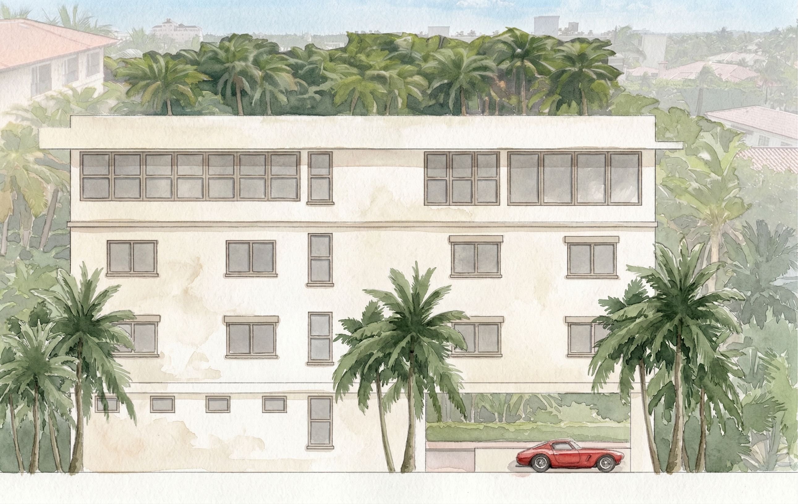
PromptDO NOT change the architecture in any way. Do not alter proportions, windows, railings, or layout. Do not add or remove elements. Do not crop the image. Keep the view front-on with only a very subtle sense of depth, while maintaining the clarity of an architectural elevation. PROJECTION CONTROL (VERY IMPORTANT): Maintain a primarily front-on elevation view Allow only minimal and controlled depth (no strong perspective) All horizontal lines must remain level and consistent All vertical lines must remain straight (no distortion or leaning) The building must read as an elevation first, not a perspective rendering The roof must remain visually flat and not tilted Do not exaggerate or expose top surfaces of the roof or slabs Mechanical equipment may have slight depth but must remain subtle STYLE: The entire image must read as a hand-painted watercolor, not a filtered or photoreal image Simulate real watercolor behavior on textured paper Use visible pigment variation, including: • uneven color washes • soft pooling of pigment • subtle blotching and tonal variation Edges should vary naturally: • some soft and diffused • some slightly defined where brush pressure would occur Avoid smooth digital gradients — all color transitions should feel organic and painterly Introduce subtle paper texture throughout the image Allow slight inconsistencies in tone to mimic real hand-painted work Reduce photoreal detail and replace with simplified, painterly interpretation IMPORTANT: Do not apply a watercolor “filter” effect Reinterpret the image as if it were painted by hand using watercolor techniques BUILDING (PRIMARY FOCUS — KEEP SHARP): Main stucco: warm creamy white (HEX #EFE7DA) Subtle tonal variation only (highlights #F6F1E8, shadows #E4DBCC) Window frames and railings: muted taupe (HEX #C8C1B6), matte finish Glass: soft gray tone (HEX #B8B6B0), minimal reflection Maintain crisp edges and clear architectural definition SHADING: Soft, even, non-directional shading No dramatic lighting or strong shadows Only subtle depth at: • window recesses • underside of slabs • balcony edges BACKGROUND + LANDSCAPE (REFERENCE-BASED, LUSH BUT CONTROLLED): Use the provided background as the base composition Enhance it to feel lush, layered, and characteristic of Palm Beach Do not fully replace the background — refine and unify it Palm trees should be full and dimensional but softened: • slightly reduce contrast and saturation • blend edges gently to match watercolor texture • maintain readable frond structure without sharp realism Introduce layered greenery (foreground, midground, background) for depth Smooth transitions between layers to avoid harsh separation Adjust greens to feel rich but controlled: • base green (HEX #A8B79A) • mid-tone (HEX #8FA77F) • deeper accents (HEX #6F8F63 used sparingly) Background buildings should be simplified, lightly visible, and desaturated Reduce photorealism and unify everything into a watercolor style Slightly reduce background contrast and detail (20–30%) so it does not compete with the building SKY: Soft watercolor blue sky (HEX #D6E6F2) Gentle tonal variation with subtle cloud texture Keep it light, calm, and slightly desaturated GROUND: Maintain a clean, straight horizontal ground line where the building meets the ground Use a light watercolor wash to suggest the ground plane Keep the building visually grounded and stable CARS: Simple, elegant watercolor-style vehicles Neutral tones (white, beige, soft gray) Minimal detail with soft edges, no harsh reflections COLOR + CONTRAST: Slightly increase warmth and color richness (10–15%) Avoid washed-out appearance Maintain soft watercolor quality with no high saturation Ensure the building reads clearly against the background MOOD: Romantic, airy, and refined Warm Palm Beach atmosphere Calm, elegant, and presentation-ready IMPORTANT: The building must remain the sharpest and most defined element Background, trees, and cars should remain softer and more painterly The final image should feel cohesive, balanced, and suitable for client presentation, keep exact camera angle
Date09 April 2026
Share