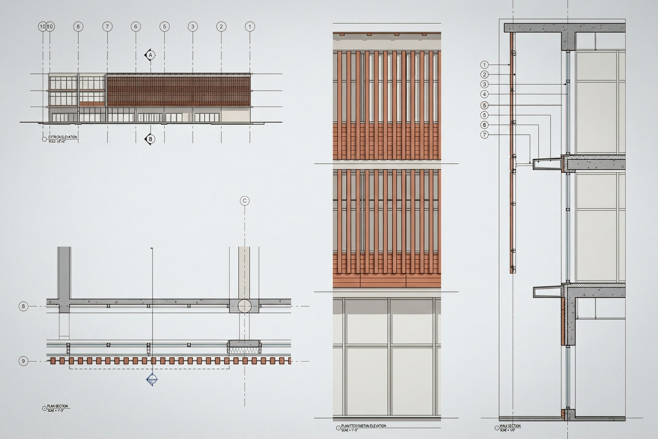
Enhance this architectural presentation sheet while preserving the EXACT layout, scale, alignment, and position of all drawings. This is a 24x36 architectural sheet containing: wall section 1/2” scale plan section 1/2” scale exterior elevation enlarged partial elevation DO NOT move, resize, crop, rotate, or recompose any drawing. Maintain all spacing, margins, and sheet organization exactly as provided. 🔷 OVERALL GRAPHIC IMPROVEMENTS Apply clear architectural lineweight hierarchy: heavy poche for cut elements structure, slabs, columns medium lines for primary geometry walls, façade edges light lines for secondary details Increase contrast and clarity for print-quality presentation Maintain clean white background with minimal grayscale tones Do not add unnecessary textures or visual noise 🧱 WALL SECTION ENHANCEMENT Refine façade as a terracotta rainscreen system Clearly define layers from exterior to interior: terracotta panel cladding outermost layer ventilated air cavity slight gap metal support substructure air/water barrier highlight with a subtle colored line continuous insulation layer structural backup wall interior finish Show insulated glazing as double line with mullions Add horizontal exterior shading device Emphasize slab edge with continuous insulation wrapping thermal break Apply subtle poche to structural elements for depth 📐 PLAN SECTION ENHANCEMENT Strengthen cut line clarity Show façade layers consistent with wall section Represent glazing as double line Indicate shading device projection dashed or solid Lightly poche columns and structural elements Clean repetitive geometry for consistency 🟫 EXTERIOR + PARTIAL ELEVATION ENHANCEMENT Apply terracotta panel system consistently: horizontal panel modules thin horizontal joint lines subtle depth offset from façade shadow gap Use warm muted terracotta tones earthy, not bright orange Add very subtle tonal variation for realism Show window mullions clearly double line thickness Add soft light gray shadows to express depth Maintain minimal, clean architectural style 🌬️ TECHNICAL CLARITY Keep all annotations, callouts, and tags in the same position Improve legibility of text clean, consistent linework Do not add new notes unless necessary for clarity Maintain all drawing scales and references exactly 🎨 COLOR + STYLE RULES Base drawings: black, white, grayscale Terracotta panels: muted clay tones only Air barrier: subtle accent color thin line only No excessive colors or rendering effects 🚫 STRICT CONSTRAINTS DO NOT change geometry DO NOT redesign façade composition DO NOT move drawings or adjust layout DO NOT change scale relationships DO NOT crop or zoom Only enhance graphic quality, depth, and material clarity. 🎯 FINAL OUTPUT STYLE Clean, professional architectural presentation sheet Balanced white space Strong hierarchy and readability Looks like a final studio-level submission, keep exact camera angle
PromptEnhance this architectural presentation sheet while preserving the EXACT layout, scale, alignment, and position of all drawings. This is a 24x36 architectural sheet containing: wall section (1/2” scale) plan section (1/2” scale) exterior elevation enlarged partial elevation DO NOT move, resize, crop, rotate, or recompose any drawing. Maintain all spacing, margins, and sheet organization exactly as provided. 🔷 OVERALL GRAPHIC IMPROVEMENTS Apply clear architectural lineweight hierarchy: heavy poche for cut elements (structure, slabs, columns) medium lines for primary geometry (walls, façade edges) light lines for secondary details Increase contrast and clarity for print-quality presentation Maintain clean white background with minimal grayscale tones Do not add unnecessary textures or visual noise 🧱 WALL SECTION ENHANCEMENT Refine façade as a terracotta rainscreen system Clearly define layers from exterior to interior: terracotta panel cladding (outermost layer) ventilated air cavity (slight gap) metal support substructure air/water barrier (highlight with a subtle colored line) continuous insulation layer structural backup wall interior finish Show insulated glazing as double line with mullions Add horizontal exterior shading device Emphasize slab edge with continuous insulation wrapping (thermal break) Apply subtle poche to structural elements for depth 📐 PLAN SECTION ENHANCEMENT Strengthen cut line clarity Show façade layers consistent with wall section Represent glazing as double line Indicate shading device projection (dashed or solid) Lightly poche columns and structural elements Clean repetitive geometry for consistency 🟫 EXTERIOR + PARTIAL ELEVATION ENHANCEMENT Apply terracotta panel system consistently: horizontal panel modules thin horizontal joint lines subtle depth offset from façade (shadow gap) Use warm muted terracotta tones (earthy, not bright orange) Add very subtle tonal variation for realism Show window mullions clearly (double line thickness) Add soft light gray shadows to express depth Maintain minimal, clean architectural style 🌬️ TECHNICAL CLARITY Keep all annotations, callouts, and tags in the same position Improve legibility of text (clean, consistent linework) Do not add new notes unless necessary for clarity Maintain all drawing scales and references exactly 🎨 COLOR + STYLE RULES Base drawings: black, white, grayscale Terracotta panels: muted clay tones only Air barrier: subtle accent color (thin line only) No excessive colors or rendering effects 🚫 STRICT CONSTRAINTS DO NOT change geometry DO NOT redesign façade composition DO NOT move drawings or adjust layout DO NOT change scale relationships DO NOT crop or zoom Only enhance graphic quality, depth, and material clarity. 🎯 FINAL OUTPUT STYLE Clean, professional architectural presentation sheet Balanced white space Strong hierarchy and readability Looks like a final studio-level submission, keep exact camera angle
Date13 April 2026
Share